WORKS
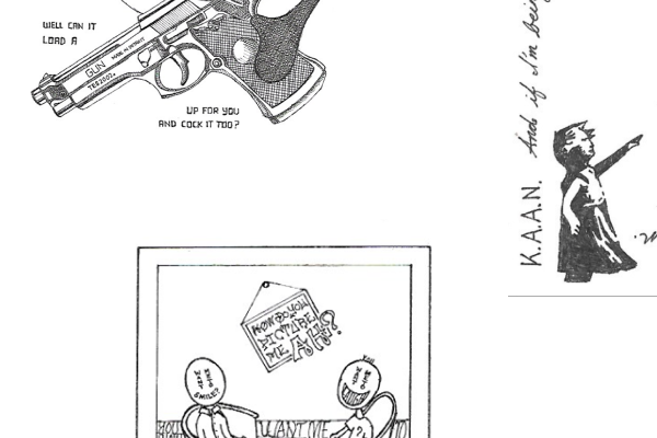
All logos were designed from scratch. The graphics and sketches were personal projects I created to grow my creativity and train my technical skills.
GRAPHICS & SKETCHES
BOOK REVIEWS

Good encouragement to copy good work and not feel ashamed. It distinguishes the difference between plagiarism and copying. It has a simple layout with main quotes in gray squares and simple images spread throughout that makes the reading very digestible.
Learned: Figure out who to copy and what to copy. Copy the thinking, not just the work. Copying help shapes our creativity and keeps our mind active.
More marketing than UIUX, but very related – concepts of defining problem, understanding customer, and storyboarding. Great layout and introducing the concept of positioning and why it matters, backed up with great examples. Some parts felt redundant but overall, great job in diving deeper.
Learned: How you frame and “position” your product is important since it affects who your target audience is. Also, targeting a narrow audience is better than broadly.

Engaging and well-written. Highlights a helpful overview of all the steps in the design process and how they flow together. Offers a great guide in the activities in each process to try out. Lots of great real-world examples as well. It focuses on the end goal and why/when to skip over some steps.
Learned: A different (fast) approach to the design process that is worth trying out and incorporating.

Easy to read, large fonts, good spacing, lots of colors and pictures, and points outlined well.
Not mind-blowing but an organized helpful resource to remind myself. Lots of great analogies, especially on the topic of navigation.
Learned: Emphasis on the fact that people really don’t read everything so it’s better to make things simple and efficient and easy to find.

Very simple introduction and jumps straight to the point (six things): 1. Goal, 2. Empathy, 3. Creation, 4. Validation, 5. Measurement, 6. Doing it again (and again)
Clear advice, straightforward lessons, and practical exercises to do with your team.
Learned: It is better to focus on specific target users and not everyone. Hone in on your idea to make one thing really good, enough to sway others to your product, instead of catering to the masses.

Ironically, not as deep into the psychology of fonts but a great starting resource for selecting fonts. Concise, intriguing, examples of real-world use with pictures.
Learned: Be more conscious of font choices as they greatly affect the overall feel of your website (or other mediums).
Great focus on understanding user pains and what people do to solve their problems. Gives a good framework of what creates a habit-forming product, dives into each, and give good examples and idea – Trigger, Action, Variable Reward, and Investment.
Learned: Painkillers are more “important” than vitamins. While it is important to understand the pros of your product, it is typically more effective to focus on the pains of users since pains solve immediate problems.


