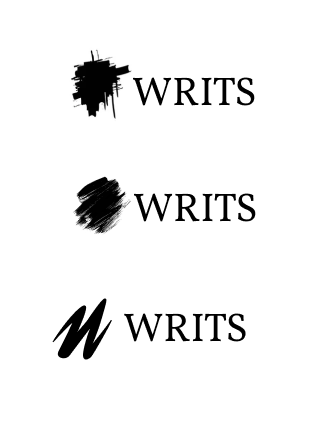
Since this was an app dedicated to writing, having a letter-mark as the logo is very fitting. It also represents a quick scribble, since Writs is focused on quick and short writings. The very name “writs” is short for writings.
A serif font was used to highlight the elegance of letters, as the traditional style of letter prints typically have serifs.

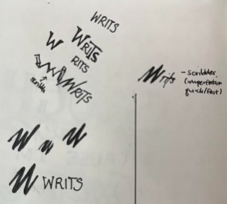
Started off with some scribbles of the logo and found one I liked rather quickly.

I tried to look for scribbles or blotches as the logomark but realized my original sketch of the “W” scribble felt more original and meaningful. This was done with a pen tool on Figma.
