The travel industry is constantly growing and more people travel for business or leisure. With IG and other social media, the most common posts are of food and travel. People love to embark on new adventures and document them for others to see.
However, there seems to be a disconnect between organizing the places a person has visited and showcasing those to friends. There is no simple and customizable all-in-one place where users can keep track of their visits and display them beautifully to their loved ones.
My role: UX/UI Designer
Research is vital to understanding the thoughts and habits of users. Each research method has a different purpose. For this project, I decided to use a mix of questionnaires, personal interviews, and competitive analysis.
Purpose: Big picture understanding of people’s travel reasons and goals (if any)
Action: Received 12 responses (more ppl would give better results but it can be time intensive and costly)
Purpose: Detailed process of how people plan trips and their pain points, as well as social media habits
Action: Conducted 4 interviews (~30m) with working adults in mid/late 20s (as they typically have more resources to travel)
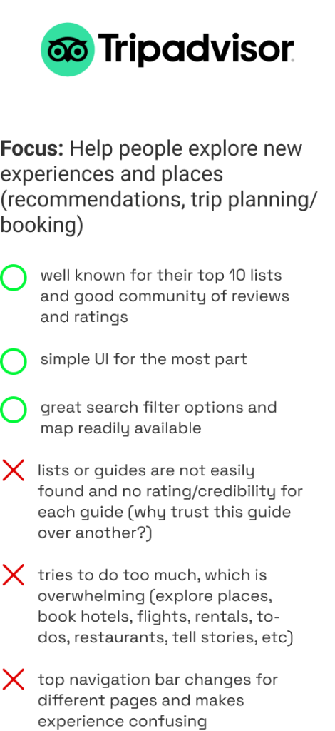
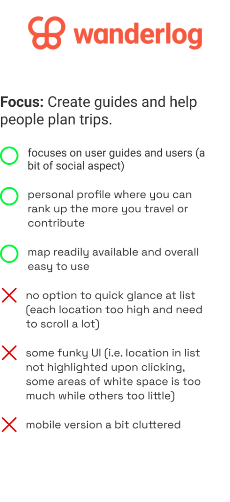
Purpose: Understand what is out there, their focus, strengths and how Mt. Everlist may solve a problem they do not
Action: Brief look at 10+ companies, but showcase the 3 most relevant – their strengths and weaknesses.
1. Common travel places: cities within US (ppl living in US), Asian countries (ppl living in Asia)
2. Travel goals: most people did not have goals (some said national parks and all 50 states)
3. Reasons people travel: wedding, concert, bachelorette party, skiing, triathlon, climbing, visiting friends or family, explore new place
Not all data is good data. Sometimes, more information slows down the process of sorting out helpful information. Knowing your focus helps create more useful questions, although sometimes, you don’t know your focus until you start asking broadly. Design is always iterative.

It was hard to find commonalities because the circumstances for traveling were very different (i.e. travelling alone vs in group, visiting friends vs exploring, city areas vs rural). If my focus was trip planning, then all these factors need to be considered. Since my focus was on list creation, this is not as important.
Similarly, when interviewing, it is best to focus on one specific thing. Having too broad of topic(s) makes the conversation flow more complex, but also, not as deep.
Learning about other competitors is helpful to understand what is available and how they serve people’s need, or in turn, how they do not meet people’s needs. I drew a lot of inspiration from their UI and gained more confidence on how Mt. Everlist would be different.


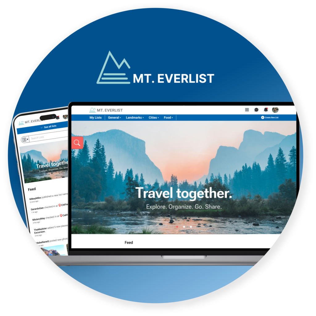
To encourage travel by allowing users to manage customizable lists to share easily and show off the places they’ve been.
Site maps are helpful to visualize the scope of the project, as well as each page’s connection to one another. My first time around, I made the mistake of skipping this step and ended up adding extraneous pages and trying to do too much. Defining this beforehand helped me focus on my end product.
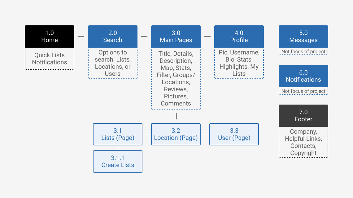
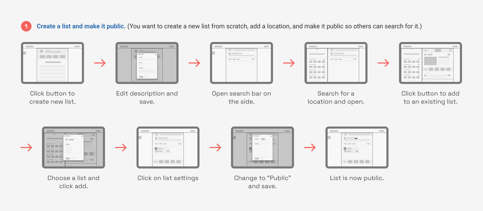
In order to evaluate the usability of the app, key tasks were identified. The task flows evolved as I conducted more user testing and understand what users needed.
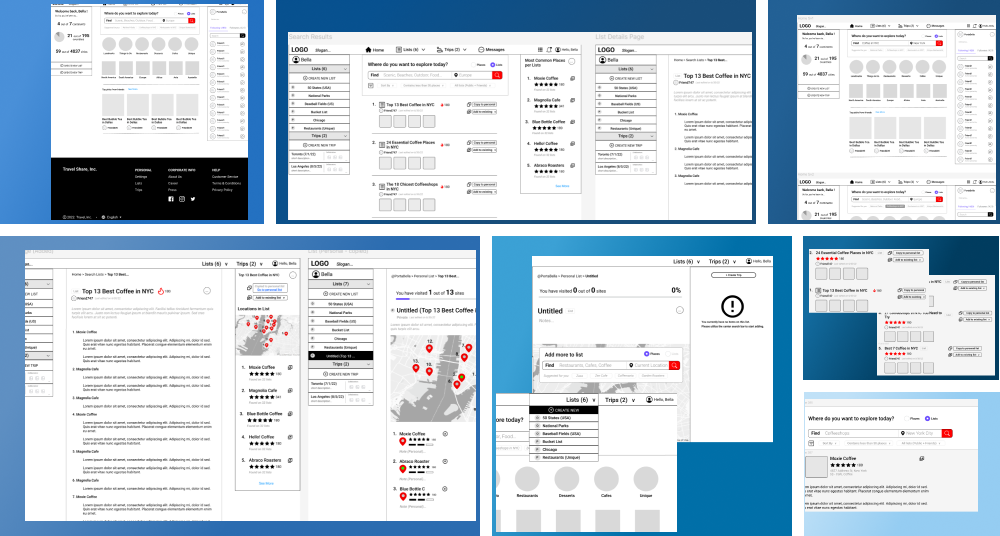
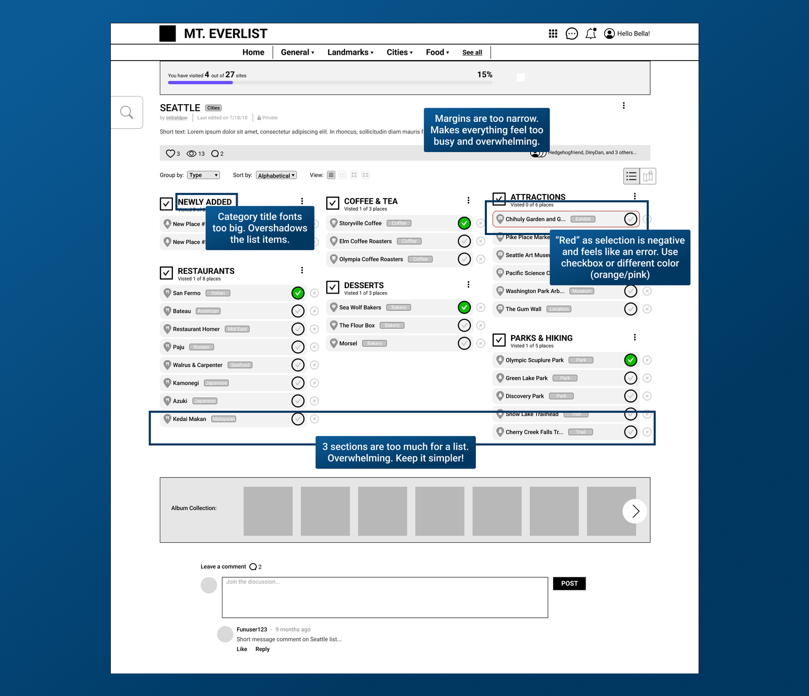
Low-fidelity wireframes were built as a starting point. This phase was messy as I kept iterating the designs over and over again. (I realized that I crammed in too many features).
Below are sample screenshots of the earlier stages. Specific features will be highlighted in a later section.
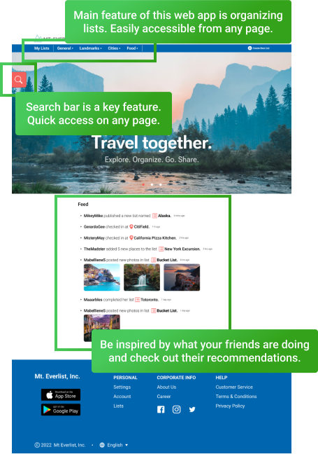
Since maps were a key feature of the experience and oceans make up the background for maps, I chose a blue as the background colors of the web pages as well.
For in-depth analysis of the logo design, see details in the link here.

Although users did not have trouble completing them main tasks, there were confusion on unrelated sections that were distracting.
One main thing I learned is to “Keep things simple!” Screens are cluttered and provide too many features. Ask myself – what are the main goals of this page? Are they obvious and easy to get to? What are needs versus wants?
There’s been a ton of iterations but below is a select few:
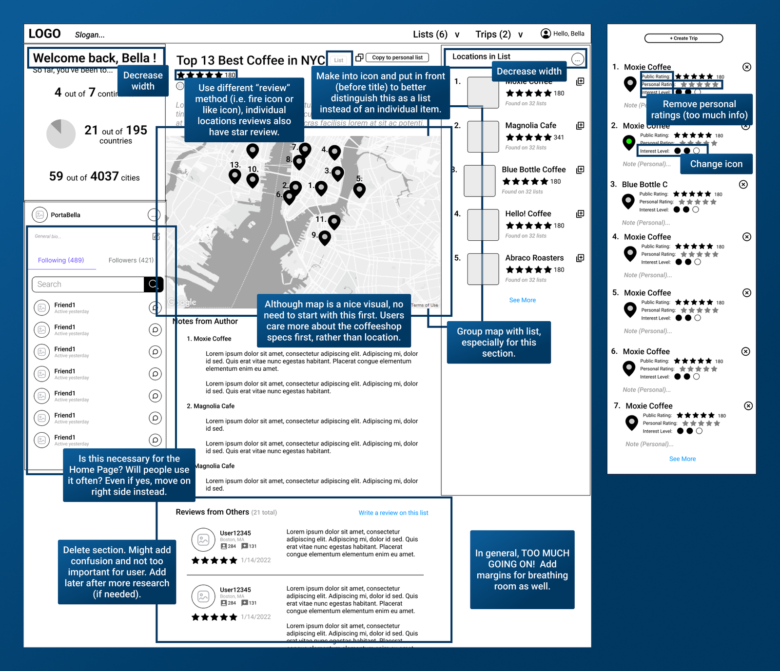
Feed is on the home page so it’s easy to notice. Friend recommendations are typically the best means to explore new places since it’s built on a level of trust.
Note: In order to declutter the space, the search bar can be easily opened or closed.
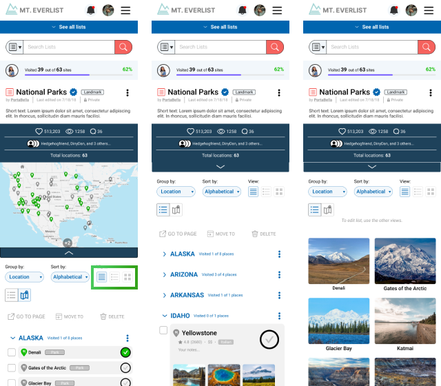
There are different options for views based on different purposes.
1. Quick list with no details (good overview of all items)
2. List with more details
3. Visual eye-candy (to present or showcase pictures to others)
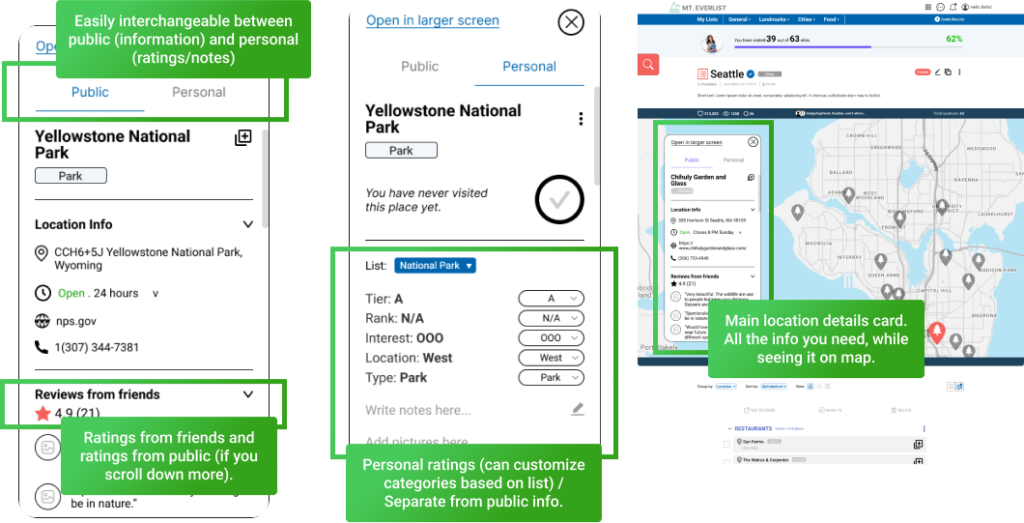
Personal ratings of each location are highly customizable – from ranking, to interest level, and more. Others can see your rankings and quickly switch between your reviews, friend reviews and public reviews for the same location.
Please check out my brief case study video below where I share a quick run-through of the prototype.
The current product is a social media page focused on travel that involves organizing lists and easy sharing. There are two main routes that can expand from this:
1. Trip planning + documentation – Trip planning starts wit cultivating a list of places and organizing them into itineraries. Being a social media platform also helps with collaborations between friends and other users.
While the second option seems like a curveball, companies often shift product usage based on research, iterations, and feedback. Popular examples include Slack (originally developers for a computer game called Glitch) and Play-doh (first sold as a cleaner that could remove coal residue from wallpaper in the 1930s).
As we roll out the MVP for the this product, we can evaluate the product and see how to best improve and pivot the next steps.
It’s important to define the scope early and make sure it’s not too big. It is better to narrow down your target audience and aim to help a smaller group than try to help everyone.
You cannot redesign a product indefinitely and at some point, you’ll need to roll out a minimum viable product (or abandon the project).
Focus should be on the most important features. Evaluate what is truly needed and remove features (sometimes temporarily) to ensure a cleaner (less cluttered) design.
Product placement is key. Midway, I found myself questioning whether this was a travel app, a list tracker, travel planner, documentation, or social media product.
Not only does this affect where I get my inspiration from, it changes my target audience and how I design the product. A certain feature might sound very important, and maybe it is for a certain target audience, but not for my product. This affects how the product will be marketed as well.
MT EVERLIST CASE STUDY SUMMARY
The video is a ~5 min summary of this Case Study. It includes a quick run-through of the prototype.