Add a feature
ITEM:
• Data-driven
HIGHLIGHTS:
• Adding/Improving features
• Research focus and biases
• Iterations through Trial and Error
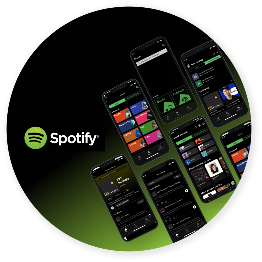
Spotify is the world’s leading music streaming platform, with over 30% of the marketshare as of 2021, well ahead of its competitors. However, it needs to expand. Spotify’s mission is to “unlock the potential of human creativity—by giving a million creative artists the opportunity to live off their art and billions of fans the opportunity to enjoy and be inspired by it.” These “artists” include podcast creators.
While Spotify already has a podcast section, its user interface can be vastly improved. Since the context of listening to podcasts differs from that of music, and the popularity of podcasts is relatively new, its interface deserves a new look into its effectiveness.
My role: UX/UI Designer
Questionnaire – User Interviews – Competitive Analysis – Empathy Map
Problem Statement – Product Goals – Project Scope
Feature 1: Song & Podcast Navigation
Usability Testing – Iterations – Hi-fidelity Prototype
The research process was a major part of this project. I started with a blank slate on what feature to implement (The idea of podcasts was not considered until after user interviews.) I focused on listening to users’ current experiences and tried to analyze the problems they were facing.
Purpose: To gather a wide scope and large quantity of data to get an initial direction.
Action: Received 18 responses (mostly young adults and teenagers)
Purpose: Deeper insights on how and why people listen to music (and podcasts). To hear their frustrations and pain-points.
Action: Two phases –
I. General interview on Spotify as a whole (all features) [5 people]
II. Focused interview on podcasts (specifically Spotify). [4 people]
Purpose: To compare the strengths and weaknesses of Spotify with other companies and for inspiration of what works.
Action: Focused primarily on the UI of Spotify’s competitors – Google podcast, Apple podcast, Youtube
Questionnaires are great for gathering a lot of information at once. They are typically short, allowing for more people to participate. Taking time to curate concise and useful questions is the key to success.
1. Music vs Podcast: Many people say they use Spotify for music but other apps (i.e. YouTube) for podcasts.
2. Spotify Rating: The average rating for Spotify app is 8 out of 10. Most people are satisfied and don’t have much issues, at least not to the point where they would stop using it.
3. Alternate apps: If Spotify did not exist, an overwhelming majority would use YouTube or Apple music, with occasional ones using Pandora and Amazon music.
Other notes:
• Mobile: Nearly everyone listens to Spotify on mobile.
• International music: Lack songs not from the United States.
1-on-1 interviews let you engage directly with actual users. You can encounter insights through subtle mannerisms and facial expressions (not possible from a remote questionnaire). Understanding the entire user experience (not just when they use the app) can unlock greater insights.
For this project, I started by conducting interviews on Spotify as a whole, in order to understand how people use the app. Then, I tried to find common habits and pain-points. Based on that, I conducted more specific interviews focused on those pain-points (in this case, podcast selection and usage).
This phase was focused on understanding how users use Spotify in general. I asked questions related to music and podcasts outside of Spotify as well. A main portion was spent on Spotify’s features – playlists, offline mode, plans, etc.
Based on results from the questionnaire and general interview, there were a lots of frustrations with podcasts usage in Spotify.
As Spotify is meant for music and podcasts, I included questions related to music to get a more holistic view of app usage.
Conducting the specific interview was different from the general interview. For the general one, I asked broader questions and was more focused on random information that may or may not be helpful (see “interesting findings” section later on). I had no real agenda and was able to listen more freely. For the interview on podcasts, I asked about their podcast experience in greater detail, including their thoughts and emotions. There was more structure to the interview and made it easier to find commonalities between different users since the scope was narrower.
Either way, both interviews were helpful in reaching my goal – to understand users.
Each company has different target audiences so what works for one might not work for another. Nonetheless, it is good to see areas where others do well (as inspiration) and where they do poorly (as opportunities).
From the interviews (and google search), the three most popular apps people use for podcasts (aside from Spotify) are Apple, Google, and YouTube.
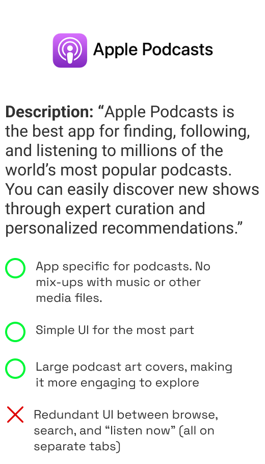
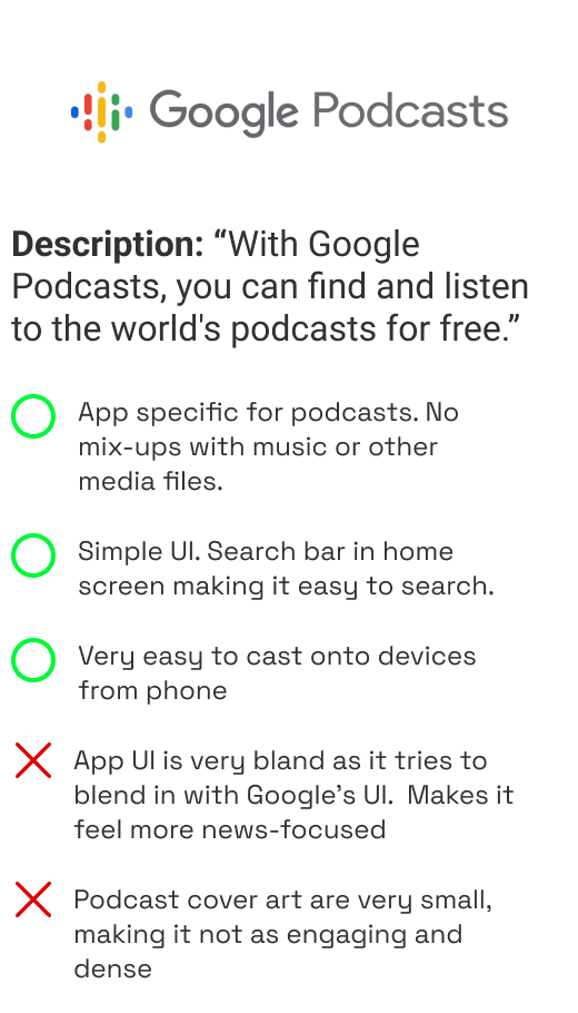
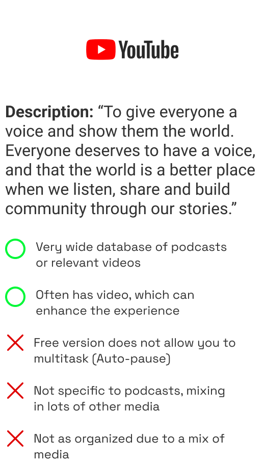
Due to Spotify being an app that does both music and podcasts, we cannot compare directly with Apple and Google podcasts that focuses on podcasts specifically. However, there are still things we can learn from (i.e. layout of information) and consider if they are helpful to the user.
People might not be using an app because it’s better than its competitors. Many people use Spotify podcasts because they use Spotify music already, so it’s more convenient.
Possible Ideas based on Research Phase (Features)
1 – Ensure proper separation of music and podcasts for less cluttered navigation.
Explore different ways to separate music and podcasts (different menu icons, tab, filters, etc.)
2 – Encourage podcast listening within a series. Create less friction to find what user needs.
Be able to search for specific podcasts in a series (i.e. related themes within podcast)
3 – Focus on personal taste and not public reviews, since reviews can feel overwhelming.
Have a “93% match” (similar to Netflix) or 80% of viewers who watched x also liked y. Use a “like”/“dislike” system instead of 5-star rating.
Spotify started off as a streaming service for music, and as their popularity grew, they expanded to other sectors, such as podcasts and audiobooks. However, how a user approaches and uses the app for podcast is very different from using it for music. Through conducting interviews, some key issues arose – from how users find new podcasts to how they manage their listening experience.

Users find it difficult and confusing when navigating between podcasts and music on Spotify.
This project also involved maintaining Spotify’s brand and style and ensuring each new feature, not only helps the users, but also aligns with Spotify’s goals.
From the research phase, I identified three areas of pain users have in regards to podcasts on Spotify. This case study will focus on just one.
MUSIC
• listens to when doing work
• listen to multiple songs in one sitting
• typically plays a playlist on shuffle based on mood
• will listen to varying artists frequently
PODCASTS
• listens to when doing chores or more mindless tasks
• listen to one or less podcasts in one sitting (often split)
• typically chooses only one podcast based on interest or new episode
• will listen to a select few podcasts consistently (3-5)
Through user interviews, I found that the way users approach and interact with music is different than with podcasts. Separating the two types of media will help users find what they want quicker.
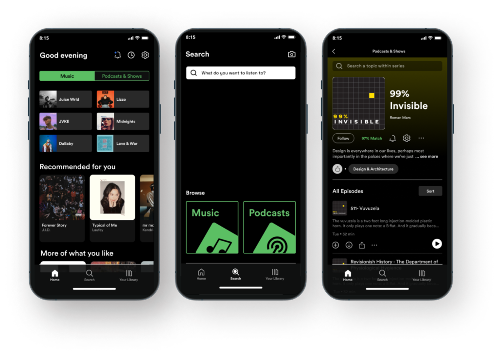
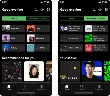
Through trialing different options, I decided to use a segmented button on each main page (except for the Search page).

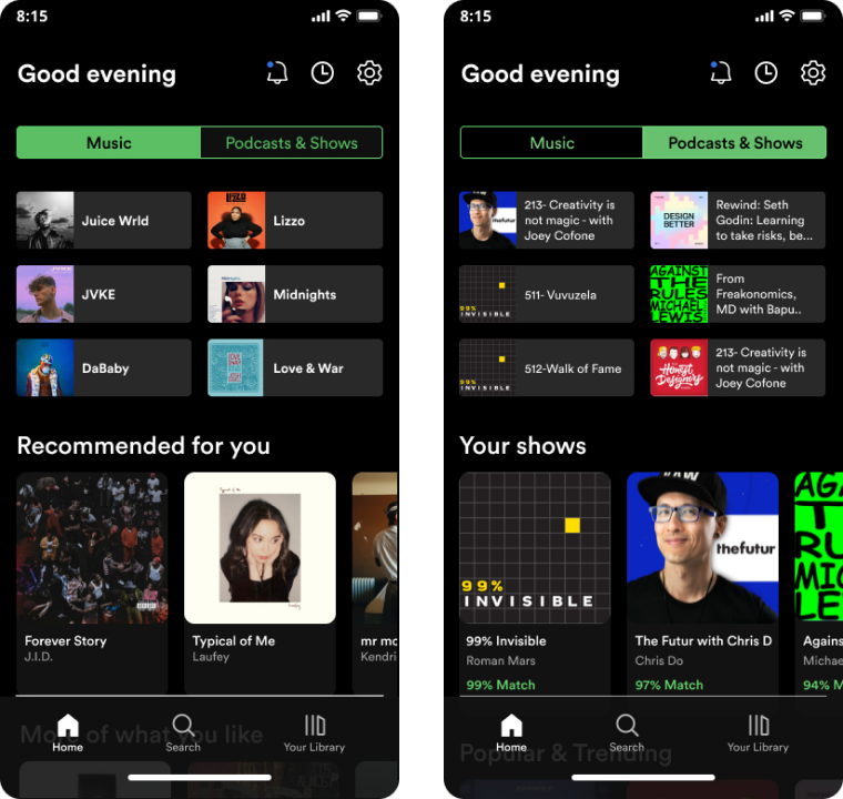
The segmented buttons are actually similar to the current Spotify UI, but the advantages it has over the current are:
1. It eliminates the current Spotify UI home screen, which is a screen that is almost never needed. (Since users typically listen to music and podcast at different scenarios, they would never need to see them mixed together, which clutters the ability to find what they want.)
2. It is clear to the user the different sections. Current UI has them as chips and once you click on one, you have to exit out before you’re able to choose another section.
There are many options and styles in adding a simple feature and the differences are often subtle. Holistic research analysis and user testing helps in seeing those subtleties and finding the best one.

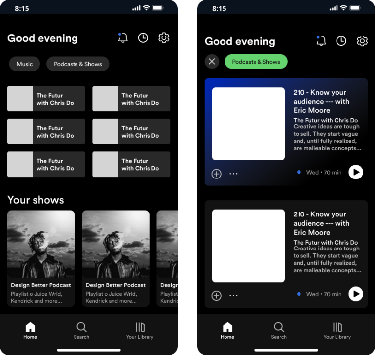
CURRENT
The Home screen is where people can quickly access media.
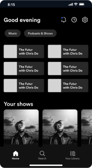
This current Home UI mixes podcasts with music, making it more cluttered and more users want.
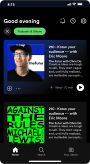
Furthermore, if you want to switch to “music” from “podcast”, you’d have to click “X”, and then click “music”.

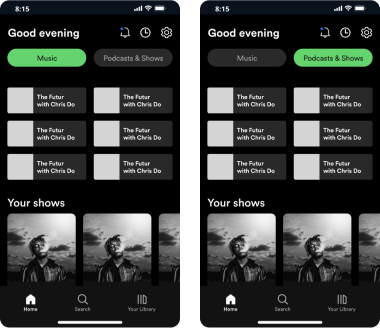
V1. THE QUICK & DIRTY
The simplest fix is having fixed “Music” and “Podcasts” buttons on the top with a toggle function.
The UI style of these buttons are kept the same for simplicity and consistency.

below
V2. MORE REFINED
Since “Music” and “Podcasts” is so primal to one’s usage of the app, I decided to play around with moving those categories to the Navigation Bar (the most “top-view” overlook of the app).
This reduces clutter on main screen, making transitions between screen to screen more seamless.
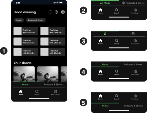
I played with a few options and chose #1 because of it’s clarity and simplicity.
#2 is too cluttered / #3 can be unclear / #4 does not make sense visually as the green bar seems to highlight the “Home” and “Search” buttons instead of the main content. / #5 is similar to #4 but also, looks odd.

FINAL
It’s ironic to come back closer to the original design after spending time re-designing and user testing.
Main issues from the “More Refined” version were:
1. Previous version did not allow for quick search since it locked users down to either “music” or “podcasts”.
2. The “Music” and “Podcasts” tabs were too small and close to the original Navigation buttons, causing higher mis-clicks. However, bigger buttons block off window space for main content.
However, instead of just reverting back to the “Quick and Dirty” version, I redesigned the tabs to be segmented buttons instead of chips.
It is important to come to research with as little bias as possible. Listening without an agenda helps me ask broader questions that can lead to insights I may not have expected. It also gives better evaluation of users’ actual needs, and not what I think they need.
When adding features, there are multiple options (style, location, etc.). It is good to mock up all versions (and do user tests) to see what works. Sometimes, the final result may look similar to the original, but subtle differences can make huge impact.
When doing research on Spotify, it is helpful to interview people who does not use Spotify. I noticed that people who use Spotify have deeper insights on the nuances of the app (i.e. doing what works for them even if it’s not the most intuitive or easy) while people who use other podcast apps are able to see areas that Spotify may be missing.