ITEM:
• Communication
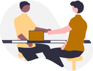
Creating a mockup is different from implementing it in the real world. Aside from the technical side of using different platforms and hosting, a key component is working with clients.
I had the privilege of working with various people and learned a lot through the process – from truly understanding the problem they wish to solve, to gathering responses to meet deadlines, to explaining why certain layouts work better instead of what they thought looked nice, and much more.
This case study will highlight some of the main things I learned from working with clients.
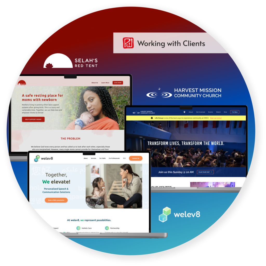
Non-profit that provides a safe resting place for moms with newborns
Easy place to donate + learn more about SRT
Squarespace
4 main pages
My first project with a client
Church in Michigan that aims to transform lost people into Christ’s disciples through God
Newcomer friendly + useful for members
Gatsby JS
20+ total pages
Work with a team of developers from scratch
Speech therapist who offers versatile and personalized care, focused on minorities and immigrants
Build trust and attract new clients
WordPress
7 main pages
Incorporate Chinese translations
Small eye care business that provides full scope optometry to Flushing and surrounding communities
Better navigation + easy to contact and locate
WordPress
7 main pages
Refresh existing website + strict timeline
Small optometry business that provides quality full-service care for eye health needs
Save cost on website + easy to contact
WordPress
7 main pages
Replicate web design with minimal changes.
Being my first project with a client, I had to figure out pricing my service, frequency of meetings, ownership of website, and much more. It was a mix of research with trial and error.
Even something as small as file organization can become big issues if I don’t provide structure upfront. Because I hadn’t set a clear system, my client shared content through different platforms (i.e. texts, emails, Canva, Google Docs), which made it harder for both of us to stay aligned.
I’ve come to realize that UX is not just about delivering a final product. A large part is understanding my client, gathering proper resources, and even teaching my client how manage the website (i.e. Squarespace) and its features (i.e. subscription, Donorbox/Stripe, etc.).
https://www.selahsredtent.com/
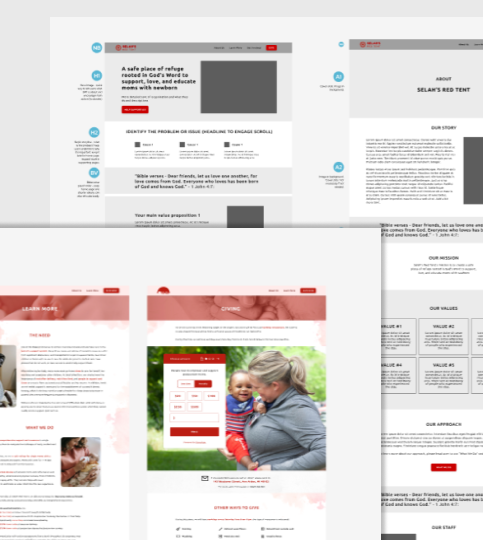
Selah’s Red Tent is a non-profit who’s mission is to be a safe resting place for moms with newborns. Financial support is dependent on generous donors who give towards the costs of baby products, nutritious meals, doula services, and building fees.
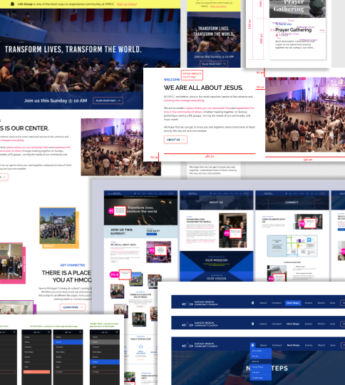
Harvest Mission Community Church wanted to revamp their entire website to be more newcomer-friendly and useful for existing members.
After meeting with the leaders to understand the website direction and approve design, I worked with a team of developers (3+ ppl). We assigned tasks through GitHub and had weekly meetings to touch base on issues, prioritize certain changes, and ensure proper implementations of design.
Despite creating mockups in Figma, I often had to give clearer direction on the designs, whether it’s alternative states (i.e. hover states and pages when no content is generated yet) or certain screen-size breakpoints. Having clear visuals where I label pixel distances, alternate states, and other comments help explain ideas much quicker and accurately.
https://annarbor.hmcc.net/

Differences in opinions are not inherently bad; what matters is how they are resolved. This project encountered its share of disagreements, from smaller issues such as color choices or button wording to significant layout changes. To address these, I often spent time creating mockups of all options to present to my client, even if I didn’t think some will turn out well.
Other times, I found myself having difficulty to articulate the benefits of certain design choices. For instance, my client preferred a button with the company slogan and an explanatory subtext before the button. While the information for what the button will do is close by, it is still more clear for users to see instructional information on the button itself.
Faced with multiple disagreements, I had to discern which issues to advocate for and which to accept and move on from. This experience pushed me to deepen my understanding of UI/UX design principles and to more effectively communicate the rationale behind different choices.
https://www.welev8sp.com/
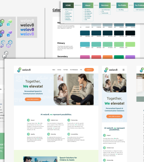
Communication difficulties can make it challenging for individuals to express themselves clearly, often leading to isolation and lower self-esteem. Welev8 (We elevate) is a private practice for empowering people in speech and communication, so they can embrace differences and enhance their quality of life.
UX design is only half of a successful designer’s job. There are lots of other hard and soft skills that you learn when you try to implement your design in real-life and interact with clients.
Good communication is necessary in understanding your client’s expectations and building their trust in your design choices. Below is a summary of some things I learned throughout my experience.
I was able to gain a greater proficiency in WordPress (and Squarespace), from how to create containers within containers properly to integrating various plug-ins smoothly.
I realized that fixing bugs and ensuring good responsiveness are one of the most time-consuming aspects. I had to constantly check how the elements responded for different screen sizes.
An area often overlooked was SEO. Since my goal was to create a successful site for my client, it could not be ignored.
A couple major things I learned was to create more content (with keywords) on every page and to add more internal links within the body text. This can be challenging as I wanted to keep a more minimalistic and less word-y look.
My biggest growth from these projects was working with clients. Some were better at communicating vision. Some were better at providing relevant information in a timely manner. Some were more opinionated on designs. Whichever the case, learning to communicate clearly and resolving conflicts were crucial to a successful launch.
To summarize from above:
A. UX is not just about the design and implementation of the final product to its users but also the experience of working with your client and meeting their needs.
B. Meetings and checkpoints are vital in communicating design intents but so are visual artifacts and annotations on designs.
C. Be intentional in articulating why certain styles or layouts work better for the users’ needs. Create visual mockups of alternative designs to help drive certain ideas.