Mt. Everest is an iconic location people go to push their physical boundaries and be challenged. It is fitting for a company that is trying to encourage travel all across the world and empower users to meet their goals.
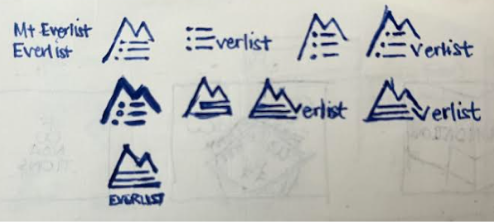
Ultimately, it is a list of places so the logo has both elements of a mountain and a list. The logo was simplified in the process to display this as simple as possible.

The name defined the logo well, as I tried to incorporate an image of a mountain and a list.

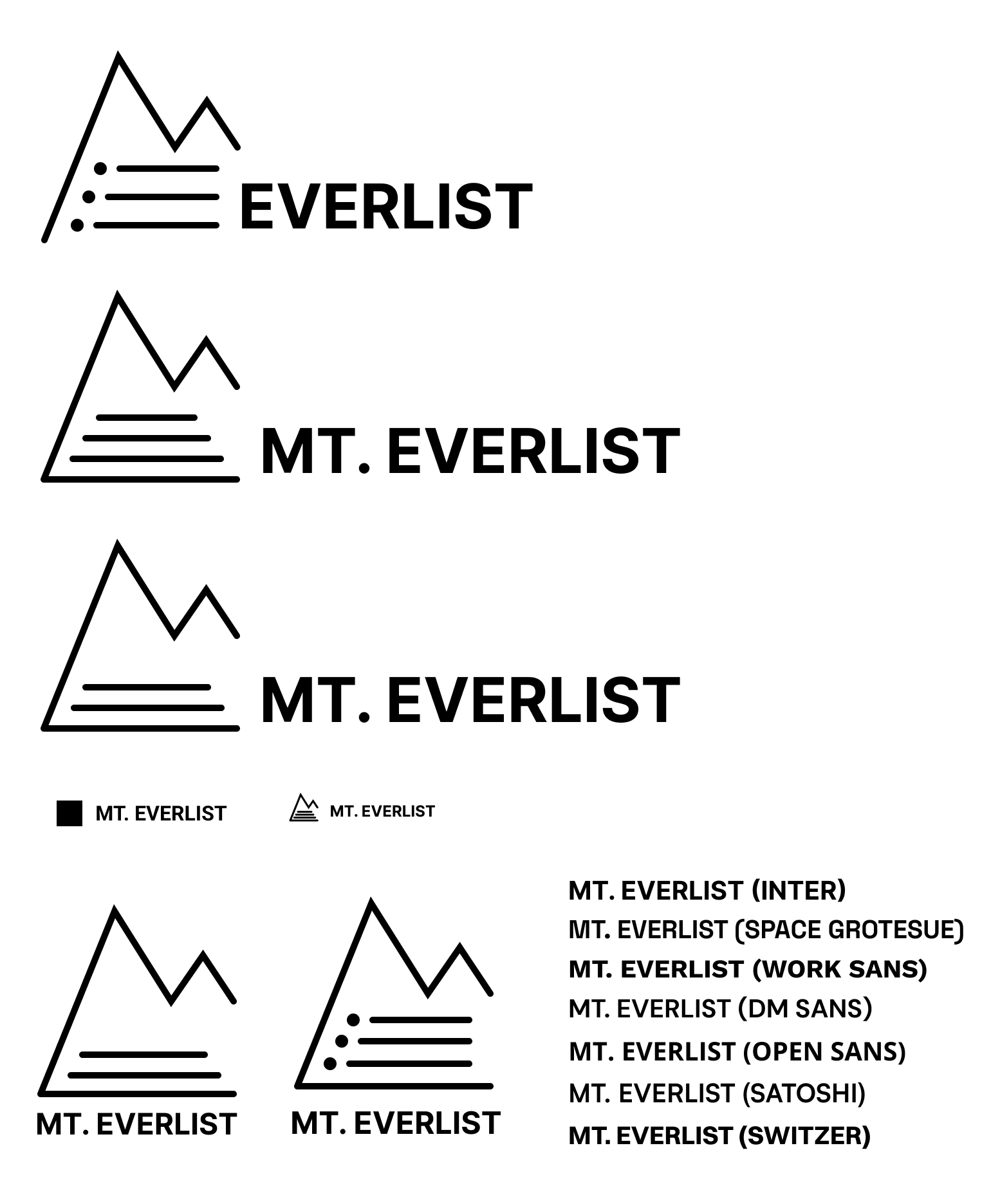
I digitized the logos and then mainly tried to simplify the logo as much as possible so the idea of a mountain and a list is still evident. The final result did not change from the original too much, but was more clean and usable at different size scaling.
