My Role: UX/UI Designer
Team: Self-directed, worked with CEO
Tools: Figma, Adobe Photoshop, WordPress
Duration: 2 months (100 hours)
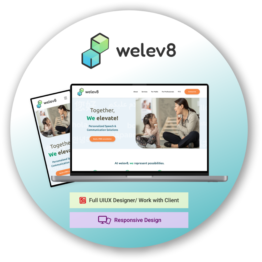
Ginni is a speech therapist who has a heart for minority communities and immigrants. To offer more versatile and personalized care, she started her private practice, ‘We Elevate.’
I collaborated with Ginni to design a user-friendly website on WordPress, making it easy for new clients to contact her and learn about her services.
https://www.welev8sp.com/
Communication difficulties can make it challenging for individuals to express themselves clearly, often leading to isolation and lower self-esteem.
Welev8 (We elevate) is a private practice for empowering people in speech and communication, so they can embrace differences and enhance their quality of life.
Before I started this project, I asked my client some basic information and guidelines on what is expected.
1. Company Profile (name, mission, values…)
2. Project Overview (type of work, tone…)
3. Project Goals (purpose, features…)
4. Target Audience
5. Design Requirements and Specs
6. Project Timeline or Schedule
7. Hosting and Maintenance
The purpose of this project is to display relevant information clearly and ensure users can contact Ginni successfully.
Here are a couple insights from other speech therapy websites:
1. Pages – Common pages are About, Services, and Contact
2. Pictures – Large pictures, typically of people smiling
Ginni has been working in a clinical setting for a few years but wants to expand her reach to minorities and immigrants in NYC and across the world. She started her private practice, welev8 (pronounced ‘We Elevate’) so that she can connect and help more people with their speech and communication.
To allow clients to contact Ginni and learn more about speech and language solutions.
1. Create questionnaire for client to fill out
2. Create logo for welev8
3. Create lo-fi wireframes, conduct user testing
4. Write text for all sections
5. Work on branding and get general feedback
6. Collect pictures
7. Create hi-fi wireframes, edit wording, input pictures
8. Create design on WordPress
9. Set up SEO, analytics and add features
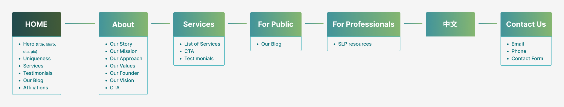
Based on the questionnaire and research, I started by creating a Site Map, which served as the scope of the project.
Low fidelity wireframes are important to add meat to the site map. It helps give a clearer visual than the site map.
The heart behind welev8 is to uplift and empower individuals to improve their communication. As it is primary therapy, Ginni wanted to exemplify a calm and trusted environment, hence a blue hue. Meanwhile, the elements of elevating and growing were represented with a green hue.
The logo incorporates a mix of green and blue, while teal is used throughout the layout. A brighter orange is added as a contrast, but also exemplifies joy. For in-depth analysis of the logo design, more details will be added in a separate section.
Based on the brand colors and style, I converted the lo-fidelity wireframes into high-fidelity.
Click here for the Figma prototype. If you want to see the live site instead, try welev8sp.com (although there will be some changes since this case study)
I was able to gain a greater proficiency in WordPress, from how to create containers within containers properly to integrating various plug-ins smoothly.
I realized that fixing bugs and ensuring good responsiveness are one of the most time-consuming aspects. I had to check how the elements responded as I drag the window browser narrower. It was helpful to have an iPhone and Motorola phone for different screen sizes.
An area I often overlooked was SEO, as it’s not directly related to design. However, since my goal was to create a successful site for my client, it could not be ignored.
A couple major things I learned through this was to create more content, especially with keywords on every page and to try to add more internal links, even within the body text. This was a challenge as I wanted to keep certain pages more minimalistic and less word-y. Of course, I don’t want to force adding in words, but they can help in subtle ways.
Differences in opinions are not inherently bad; what matters is how they are resolved. This project encountered its share of disagreements, from smaller issues such as color choices or button wording to significant layout changes.
To address these, I often spent time creating mockups of all options to present to my client, even if I don’t think some will turn out well. Other times, some decisions required A/B testing, which we did not have the budget or time for.
I found myself having difficulty to articulate the benefits of certain design choices, prompting me to deepen my understanding of UI/UX principles. For instance, my client preferred a button with the company slogan and an explanatory subtext before the button. However, it is more clear for users to see instructional information on the button itself.
Faced with multiple disagreements, I had to discern which issues to advocate for and which to accept and move on from. This experience pushed me to better understand UI/UX design and to more effectively communicate the rationale behind different choices.