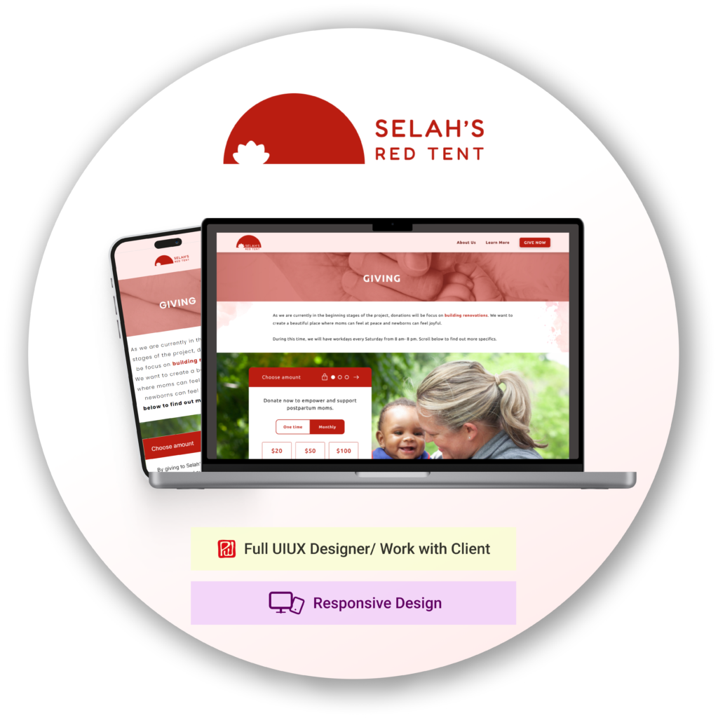
SELAH's RED TENT
My Role: UX/UI Designer
Team: Self-directed, worked with CEO
Tools: Figma, Adobe Photoshop, Squarespace
Duration: 4 months (100 hours)
OVERVIEW
Selah’s Red Tent (SRT) is a non-profit who’s mission is to be a safe resting place for moms with newborns. Financial support is dependent on generous donors who give towards the costs of baby products, nutritious meals, doula services, and building fees.
Currently, Leslie (founder of SRT) raises support by engaging in personal outreach and explaining her vision. However, she aims to expand her reach to a broader audience and establish a more structured approach to fundraising.
I collaborated with Leslie to create a user-friendly website on Squarespace so donors can support Selah’s Red Tent with ease.
https://www.selahsredtent.com/
Selah’s Red Tent (SRT) helps mothers living in poverty, as they often lack support systems after giving birth. This is a scary and vulnerable time. SRT provides housing spaces for postpartum moms along with doula assistance and workshops to better equip moms to take care of their newborns.
01 Research
QUESTIONNAIRE
Before I started this project, I asked my client some basic information and guidelines on what is expected.
1. Company Profile (name, mission, values…)
2. Project Overview (type of work, tone…)
3. Project Goals (purpose, features…)
4. Target Audience
5. Design Requirements and Specs
6. Project Timeline or Schedule
7. Hosting and Maintenance
COMPETITIVE ANALYSIS
The purpose of this project is not primarily to distinguish my client’s site, but to display relevant information clearly and ensure users can donate to SRT successfully.
Here are a few insights from other non-profits:
1. Home pages have a large/concise description of its mission
2. Headers had: About us, Our Work, Get Involved, GIVE sections
3. The overall feel and wording is positive, despite some negative words when it comes to portraying needs. There is caution that the people we serve are not portrayed as simply victimized or helpless.
02 Define
Lots of people have been asking Leslie on how they can support her. It’s not convenient to physically meet up with Leslie due to time or distance. On Leslie’s side, it’s not easy to manage all the cash and checks that come her way and ensure she doesn’t mix them up with her personal finances.
PROBLEM STATEMENT
To provide easy access for people to donate to Selah’s Red Tent.
SCOPE
1. Create questionnaire for client to fill out
2. Create logo for SRT
3. Create lo-fi wireframes, conduct user testing
4. Request specific information to fill out wireframe sections
5. Work on branding and get general feedback
6. Collect pictures from client
7. Create hi-fi wireframes, edit wording, input pictures
8. Create design on Squarespace
9. Attach domain name, set up newsletter and donation details
03 Design
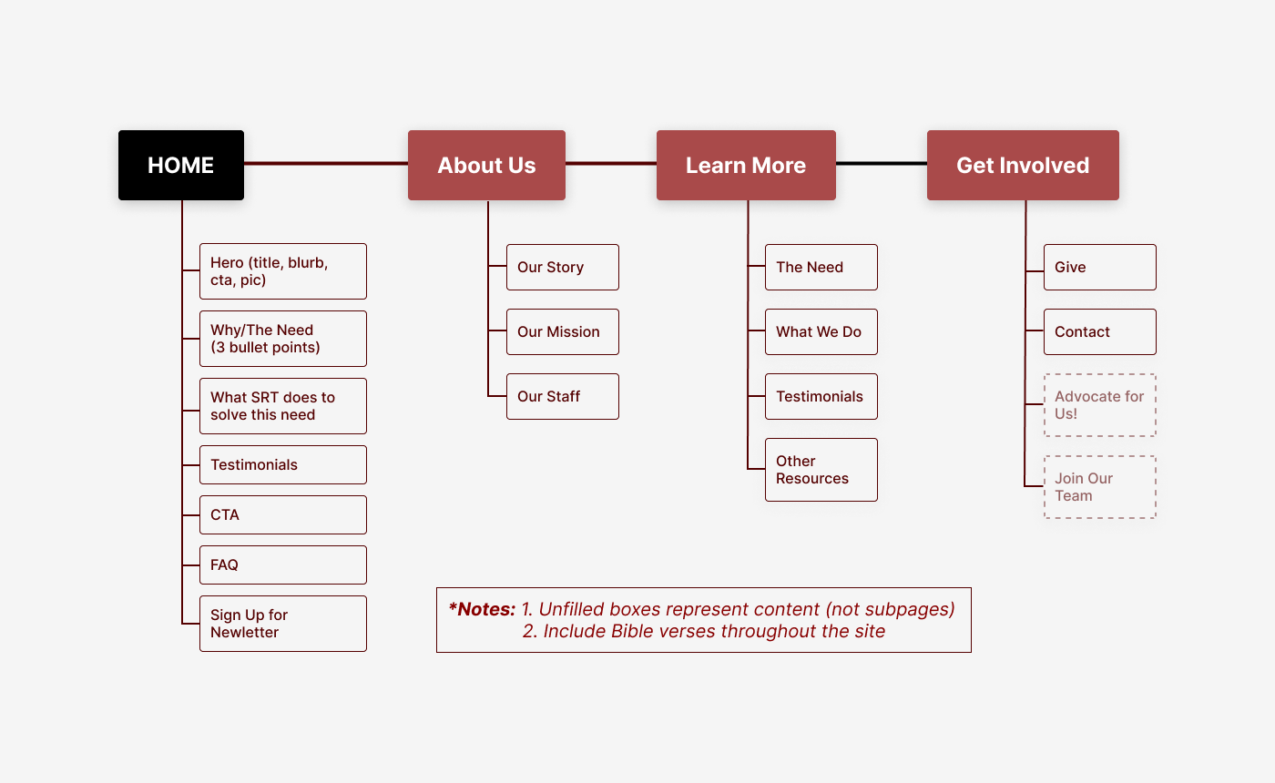
Based on the questionnaire and research, I started by creating a Site Map and identifying User Tasks.
These served as the scope of the project and a criteria to evaluate success.
USER TASKS
Some tasks include:
1. Find information about what SRT does.
2. Sign up for a newsletter to stay up to date.
3. Make a one-time donation of $50 to SRT.
SITE MAP
WIREFRAME (LO-FI)
Low fidelity wireframes are important to add meat to the site map. It helps give a clearer visual than the site map.
04 Prototype & Test
USER TESTING
A prototype was created using Figma and tested with three users. We wanted to ensure people can perform key tasks without issues. To no surprise, “donating money” is the most important and quickest task to be completed, especially with the Call-to-Action being the giving button. Overall, there were no major issues in completing all tasks in a timely manner. It also helps that there were only four pages total.
(Prototype is shown at the end of this section.)
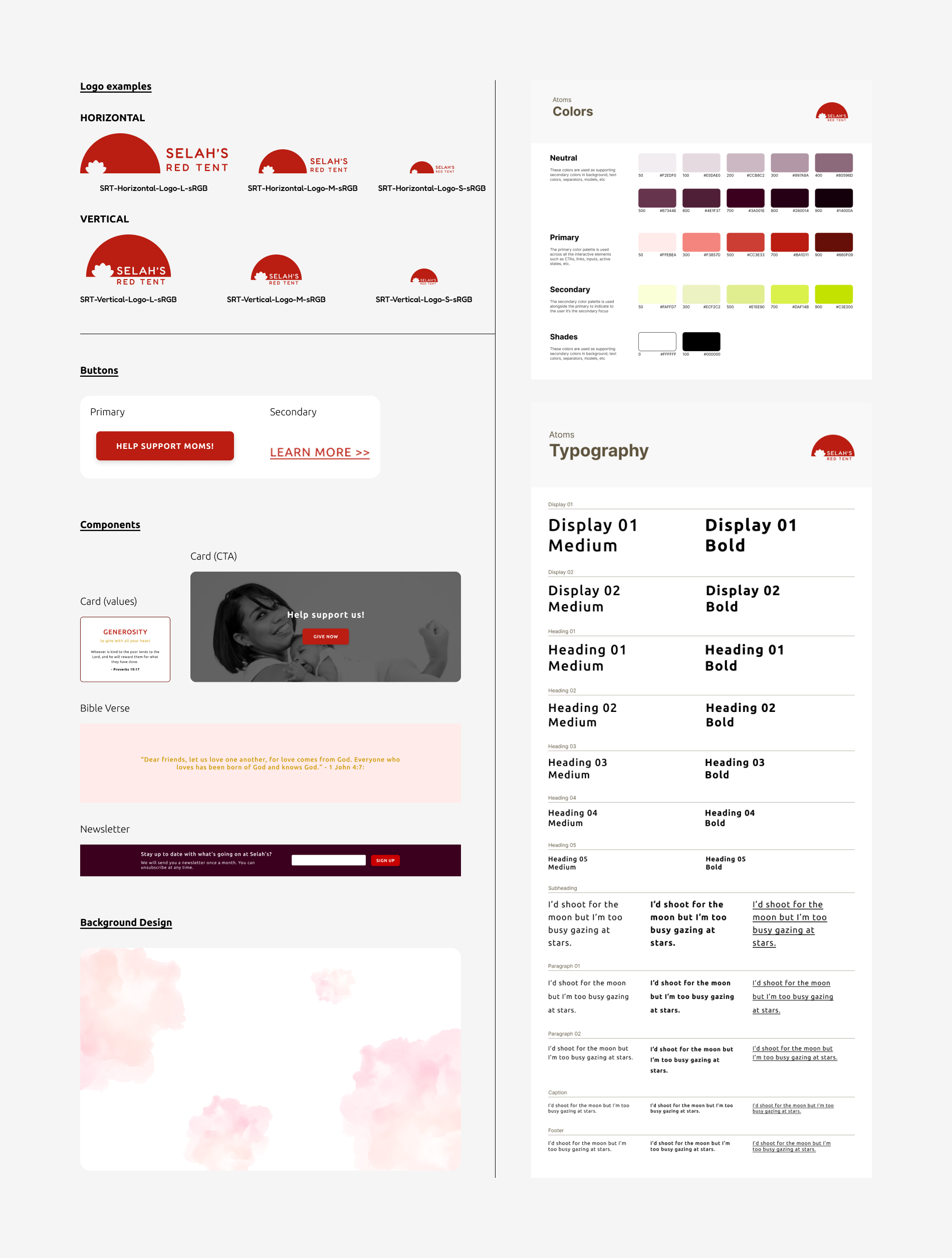
BRANDING & UI KIT
With the company name being “Selah’s Red Tent,” it made sense to use red as a main color. Per my client’s request (and since the company is related to moms with newborns), I tried to add elements of femininity throughout the site – i.e. pink hues, floral designs, rounded edges (vs sharp corners). The background design has soft light watercolor-ing that makes it feel more floral.
For in-depth analysis of the logo design, see details in the link here.
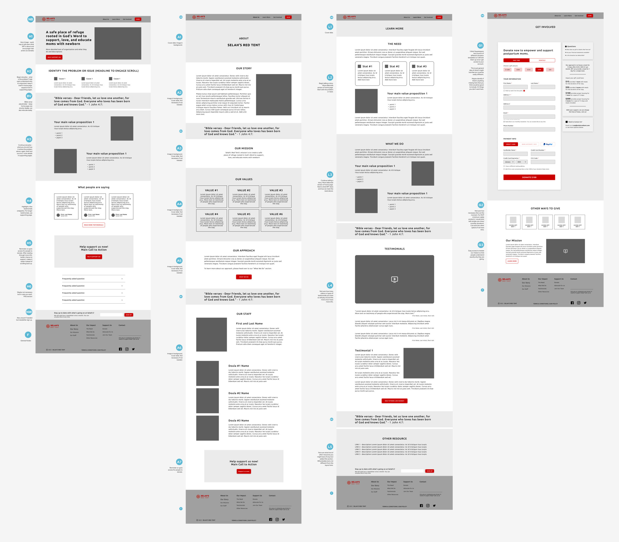
WIREFRAMES (HI-FI) & UX WRITING
Based on the brand colors and style, I converted the lo-fidelity wireframes into high-fidelity.
Although unplanned, I ended up being the sole content curator, image selector and UX writer. The content I received were a mix of emails, text blobs, and verbal. I had to filter out redundant information and reword all sentences to ensure coherency throughout each section and the entire website. Despite the complexity, it was a good experience.


FINAL PROTOTYPE
Click here to check out the Figma prototype. If you want to see the live site instead, try selahsredtent.com (although the site has evolved since this case study).
05 Conclusion
WHAT I LEARNED
1. LIMITATIONS
Aside from the technical skills of building a website on Squarespace, an important lesson was seeing how the end product can have limitations to your original design (i.e. margins, component spacing, image sizes).
Know your platform and/or developer limitations before or throughout the design process.
2. ADDING CONTENT
Midway into the project, there was a change in scope – adding a section for building renovations. Long story short, I realized I had to rethink the purpose and big-picture layout of the entire site. It’s not as simple as inserting a section into the existing layout.
3. WORKING WITH CLIENT
My biggest growth from this project was working with a client. Some challenges include figuring out pricing, how to organize files with client, frequency of meetings, ownership of website, and more. It was a mix of personal research with trial and error.
A. Establishing checkpoints is vital. Setting up meetings and getting approvals throughout the process made everything smoother. From the initial questionnaire to the site map to the wireframes, it was easy to point back at what we agreed upon.
B. In hindsight, the two main things I would change would be establishing a clear project timeline and setting standards on how files were to be sent and managed.
C. It’s not just about delivering a final product. A large part is explaining the process (why I chose to do things in a certain way) and teaching my client how to use Squarespace and its features (subscription, Donorbox/Stripe, etc.).
SRT CASE STUDY SUMMARY
The video is a ~5 min summary of this Case Study. It includes a quick run-through of the prototype.