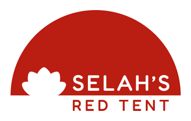
SELAH'S RED TENT LOGO
The large red tent is a symbolic feature of the logo. It represents the very idea of the non-profit: A resting place for women caring for women in their birth and postpartum season.
The roundness of the tent reflects a safety (as opposed to a pointed tent). The font was selected to have round edges as well for the same reason. The flower entrance of the tent adds to the aspect of love, care, and femininity where women can care for one another. Details of the logo design process are shown below.
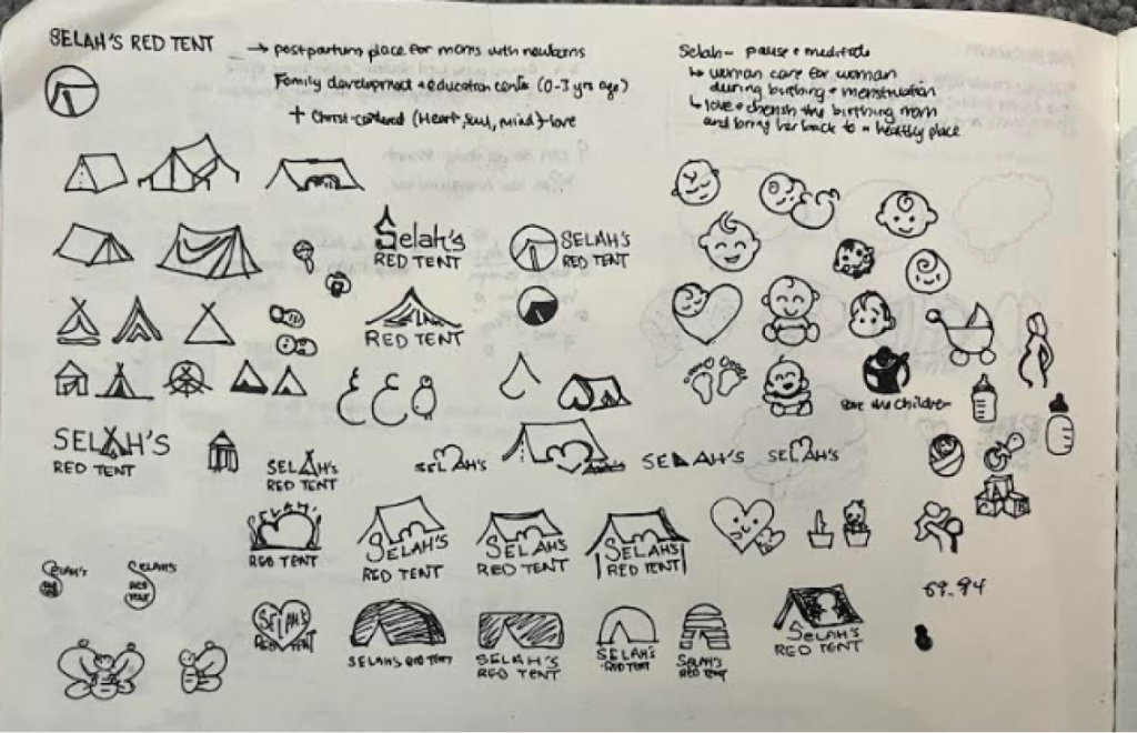
I. Sketches
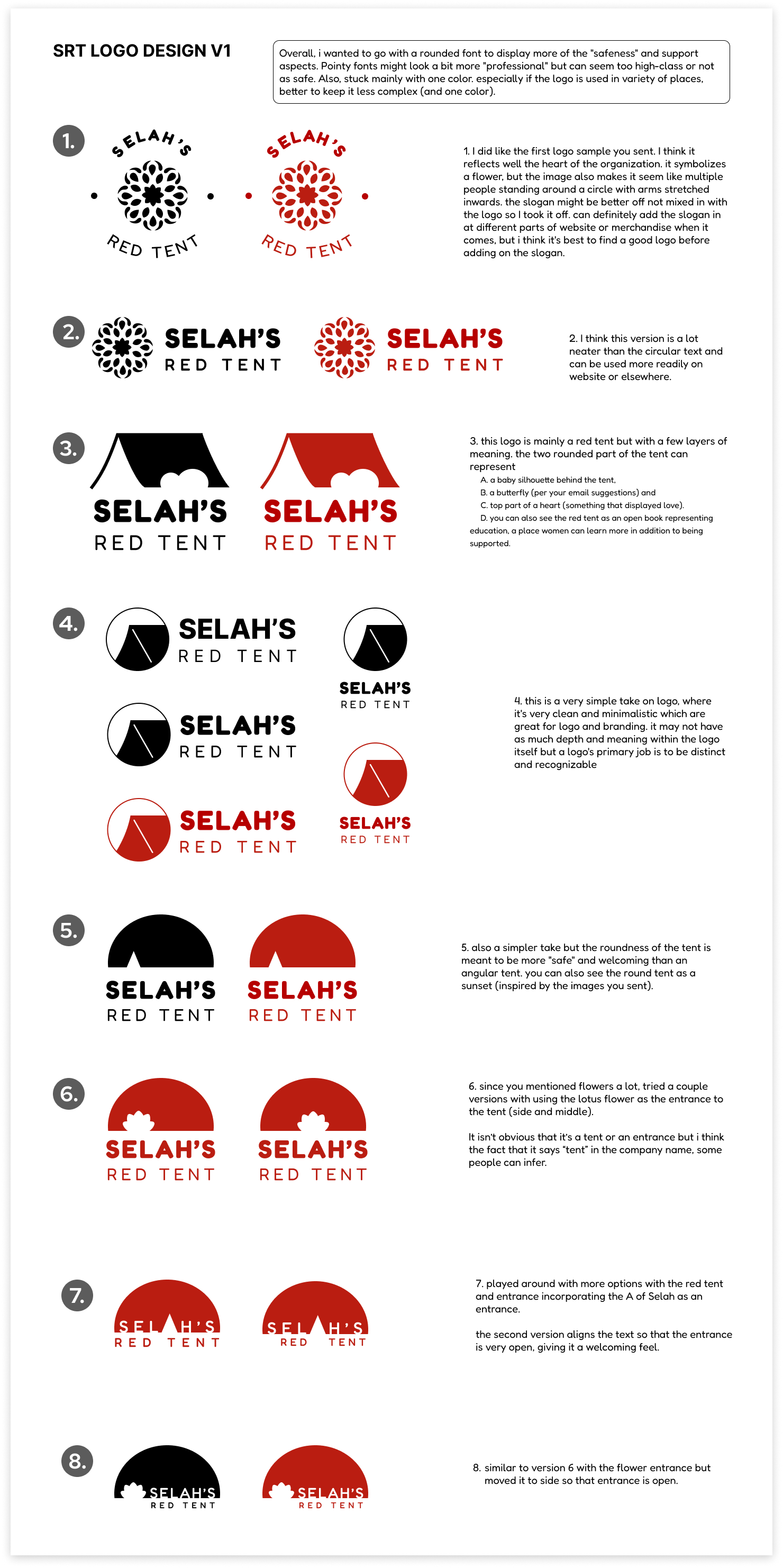
II. Digital Draft v1
Based on the sketches, I tried to draft the ones I thought were promising on the computer. I mostly used the pen tool from Figma. Kept it simple by using black and/or red. For some, I made multiple versions and explained the idea on the side. I sent this to my client for review and feedback.
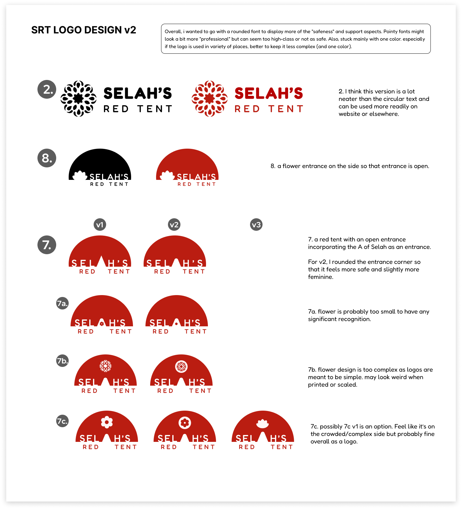
II. Digital Draft v2
